Archive for the ‘WPF’ Category.

A quick overview of MVVM

Model View ViewModel (MVVM) is a design pattern based on Model View Controller (MVC) but specifically tailored to Windows Presentation Foundation (WPF).

MVVM is not a framework per se but many frameworks have been created. Here is a list of MVVM Frameworks from Wikipedia.

See the Wikipedia site here: Open Source MVVM Frameworks.

Another blog, has some basic information on many of these here: A quick tour of existing MVVM frameworks

A framework is actually not necessary to implement MVVM and you should seriously consider whether using one is right for your WPF application or not. Many applications do not need much of the features the frameworks provide. However, there are two common classes that all MVVM frameworks contain. These are ViewModelBase and RelayCommand. Though some frameworks may give them different names or implement them slightly differently, they all have these classes. For example, MVVM Foundation names the ViewModelBase differently. It is called ObservableObject, which is more appropriate because it is incorrect to assume that all objects that implement INotifyPropertyChanged are going to be ViewModel objects.

Instead of installing and using an MVVM framework, you could simply include these classes in your application, as these are all you need to implement MVVM.

  • ObservableObject
  • RelayCommand

While these two classes are enough, you may want to investigate how different MVVM Frameworks implement and what else they implement and why. You may find that another feature implemented is exactly what you need in your application and knowing about it could save you time.

Refreshing a button enabled/disabled by RelayCommand.CanExecute

When using the RelayCommand class, a command class used for MVVM development, you may find times when a button that is enabled or disabled based on RelayCommand.CanExecute does not refresh until a keyboard or mouse click.  When this happens you may have to manually force this refresh to occur. You can force the refresh in the ViewModel with this function:

CommandManager.InvalidateRequerySuggested();

If you want to see this in action, you can download the LDPing project I have recently made.

svn co https://ldmsplugins.svn.sourceforge.net/svnroot/ldmsplugins/LDPing

You don’t need to know about LANDesk or know what an LDPing is to understand what is going on enough to see how to use this one function. In the LDPing project, clicking the button starts a background process to run an LDPing. The button disables when clicked. Once the ping is finishes, the button should enable, however, originally it didn’t enable.  I had to add the CommandManager.InvalidateRequerySuggested() function.

Here is the code:

        /// <summary>
        /// This is the Ping method that launches an LDPing as a BackgroundWorker process, using
        /// PingWorker which is an object that inherits BackgroundWorker and adds one property called
        /// PingSucceeded.
        /// </summary>
        private void Ping()
        {
            IsPinging = true;
            ClearPingResults();

            PingWorker worker = new PingWorker();
            worker.DoWork += new DoWorkEventHandler(worker_DoPing);
            worker.RunWorkerCompleted += new RunWorkerCompletedEventHandler(worker_PingCompleted);
            worker.RunWorkerAsync();
        }

        void worker_DoPing(object sender, DoWorkEventArgs e)
        {
            Stopwatch timer = new Stopwatch();
            timer.Start();

            // Now lets ping
            PingWorker worker = sender as PingWorker;
            LDPing tmpLDPing = LDPingAction.AgentPing(IPAddress);
            if (tmpLDPing == null)
                worker.PingSucceeded = false;
            else
                worker.PingSucceeded = true;
            timer.Stop();

            // Lets make sure the GUI spinner has at least a little spin
            int i = 1200 - (int)timer.ElapsedMilliseconds;
            if (i > 0)
                Thread.Sleep(i);
            LDPing = tmpLDPing;
        }

        void worker_PingCompleted(object sender, RunWorkerCompletedEventArgs e)
        {
            IsPinging = false;
            PingWorker worker = sender as PingWorker;
            if (worker.PingSucceeded)
                ConnectionResult = "Ping Successful.";
            else
                ConnectionResult = "Ping failed.";

            // This makes the UI refresh against the RelayCommand.CanExecute() function.
            // Essentially, this makes the button enable when pinging is done.
            CommandManager.InvalidateRequerySuggested();
        }

Without the CommandManager.InvalidateRequerySuggested() function, the button’s enabled state doesn’t refresh until an event such as a keyboard or mouse click.

Timing a process

So I wanted to see how long some of my code took and if it didn’t take long enough, make it take longer. Yes, I really said that and I have a good reason for it.

My use case is this:

  • I have a process that is being kicked off using BackgroundWorker.
  • For user experience reasons, I wanted my WPF GUI spinner to have a minimum time of 1.2 seconds that it spins while a process runs.

See my spinner post: WPF replacement options for an animated gif or How to make a spinner?

Here is what I did:

    void worker_DoWork(object sender, DoWorkEventArgs e)
    {
            Stopwatch timer = new Stopwatch();
            timer.Start();

            // Now lets do the work that you need a spinner for
            // Your code goes here ....

            timer.Stop();

            // Lets make sure the GUI spinner has at least 1.2 seconds of spin
            int i = 1200 - (int)timer.ElapsedMilliseconds;
            if (i > 0)
                Thread.Sleep(i);
    }

How to animate an edit box to slide in and out using Expression Blend

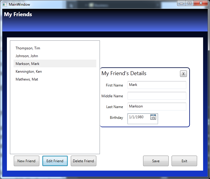
Ok…so I created a simple WPF and MVVM application called My Friends.  This is just a simple applications, the main goal was not to create a My Friend app, but do demonstrate how to make an edit box slide in an out.

The application is too big to give you step by step instructions to create the whole application, so instead, I am going to make it available for download and then tell you how to see the changes.

  1. Download and extract the solution from the link below:
    MyFriends.zip
  2. Open the project in Expression Blend (not Visual Studio).
  3. Get to know the Application. (Ok, I guess you could do this part in Visual Studio…but the intent is to learn an Expression Blend feature.)
    Check out the Person and PersonCollection classes in the Model folder.
    Check out the Views and the corresponding ViewModels and look at the binding statements.
    The MVVM folder has some standard MVVM classes, that if you know MVVM you should be familiar with.
    The business has an XML Serialization helper class.
    The data folder contains an XML that is serialized from the PersonCollection class.
  4. In Expression Blend, open the View\FriendListView.xaml.
  5. In the Objects and Timeline tab, get to know the assets that are being used. (I think they are all standard assets. I don’t think I am using anything that doesn’t come with .NET and Expression Blend by default.)
  6. In the Objects and Timeline tab, specifically look at the PersonDetailsView object.
    Notice it is behind the FriendList.
    This is the edit box that is animated and it will slide to the right when you click edit.
  7. Go to the States tab.
    Look a the State group that is created. There are two groups: EditFriendOpenState and EditFriendClosedState.  The names should be obvious.
    Notice the Transition duration is set to .5 and notice the Easing function.
  8. There is a behavior or action called GoToStateAction that was dragged over the Edit button and configured to change the state to EditFriendOpenState.
  9. The GoToStateAction was also dragged over the X button on the edit page and configured to change the state toEditFriendClosedState.
  10. Build the application and see how the state changes and how it uses the Easing function for .5 seconds to slide the edit field out.

Here is a sample image:

Anyway, I hope you find this a fun sample application to learn with.


This project is also an example of:

  • Basic C#
  • Xml Serialization
  • MVVM (including ICommand and RelayCommand with buttons)
  • Using Data Converters (as one converter is used)

Exercises for further learning:

LINQ exercise

  • There is a comment in the View\FriendListView.xaml that uses LINQ, but there is a reason LINQ wasn’t used, can you determine the reason.
  • What would you have to do to use LINQ and make the application work?

DateTime exercise

  • There is an Age property that was left commented out.  Uncomment it, make it read-only and make it provide the correct number in years based on the Birthday.

How to make a transparent cube in Expression Design

In order to provide a good example of using the polygon and square tool, here is how to make a square look 3D.  Be aware that is a 2D image made to look like 3D.

Transparent Cube

What you will learn

  • Using the rectangle tool
  • Using the polygon tool
  • Make edges by simply using slight color variations
  • Transparency
  • Front vs back placement of element

Step 1 – Create a new Expression Design document

  1. Open Expression Design and click File | New.
  2. Name the file TransparentSquare.design (or whatever name you would like).
    Note: I used a custom width and height of 300x 300, and left the resolution at 96.
  3. Click OK.

Step 2 – Create the first square

This first square will be the face of the cube.

  1. Click the Rectangle on the ToolBox.
    Note: If you cannot find it, try pressing “M” as that is the shortcut key.
  2. Draw a rectangle on the screen while holding down the shift key(the shift key is what tells Expression Design that you are looking for a perfect square and not a rectangle).
    Note: The X and Y placement of the square are: 131.5, 160. The width and height of my square are both 200.2 px. The Rotation Angle and Skew Angle are both 0.
  3. With the square selected, go to the properties tab.
  4. Under Appearance, click the Fill tab.
    Note: Hold your cursor over the tab and it will tell you which tab is the Fill tab and which is the Stroke tab.
  5. Select the Gradient option.
    Note: It is the bottom left of the four boxes just left of the color boxes. Once you click this, you will have a gradient bar.
  6. To the right of the gradient bar, there are two gradient options: Linear Gradient, Radial Gradient.
    Choose Linear Gradient.
  7. On the gradient bar, you should see two markers (squares with a triangle on top).
    Click the left marker and set the color to a nice blue.
    I used #5A78D8.
  8. Click the right marker and set the color to a blue that is darker than the first one you selected.
    Note: I used color #153FC4.
  9. Click the Stroke tab.
  10. Under the Stroke tab and all the way under the color picker, look for a drop down menu. (By default this menu has an image of a black line but can have many options.)
  11. Change it to No Stroke.
  12. Change the Stroke Width to 0 px.
  13. For Transparency, there is an Opacity setting. In case you didn’t know, Opacity is the antonym of Transparent, so setting the Opacity to 90% would be the same as setting a Transparency of 10%.
    Set the Opacity to 90%.

Step 3 – Create the right side of the cube using the Polygon tool

  1. Click the Polygon on the ToolBox.
    Note: If you cannot find it, try pressing “J” as that is the shortcut key.
  2. Draw a polygon on the screen just to the right of the square.
    The size doesn’t really as it will get its size as we move the corners into place.
    Note: The width and height of my square are both 200.2 px.
  3. With the polygon selected, go to the properties tab.
  4. Changes the points from 4 (there are only 3 points by default).
  5. Click Direct Selection on the ToolBox.
    Note: If you cannot find it, try pressing “A” as that is the shortcut key.
  6. Click the bottom left corner of the Polygon and drag it to exactly the bottom right corner of the first square.
    Note: Zooming in can really help you get the corners to line up.
  7. Click the top left corner of the Polygon and drag it to exactly the top right corner of the first square.
  8. Make sure the left side line of the polygon is perfectly straight up and down to match the square.
  9. Click the top right corner of the polygon and drag somewhere up and to the right at an angle that seems to be a good perspective angle.
  10. Click the top right corner of the polygon and drag somewhere up and to the right at an angle that seems to be a good perspective angle, probably a little bit sharper an angle than the top angle.
  11. Make sure the right side line of the polygon is perfectly straight up and down to match the square
  12. Remove the Stroke.  You should already know how to do this now.
  13. Set the Fill to a single color that is a slight variation of the blue we used for the face of the square.
    Note: I used #002DB8.
  14. Set the Opacity to 90%.

Step 4 – Create the top side of the cube using the polygon tool

Note: These steps are a little more general as you have already performed these above.

  1. Click the Polygon on the ToolBox.
  2. Draw a polygon on the screen just to the top of the square face.
  3. Changes the points from 4 (there are only 3 points by default but since you already chose 4 it maybe is chosen for you now).
  4. Click Direct Selection on the ToolBox.
  5. Move the four corners of the polygon into place.  Three of the corners are already positioned for you. Only the top left corner is not.  Make sure to give it a little more angle to make the perspective look right.
  6. Remove the Stroke.
  7. Set the Fill on top to gradient and use a lighter blue.
    Note: I used#92A7EB for the left gradient stop and #7B97EB for the right gradient stop.
  8. Set the Opacity to 90%.

Step 5 – Create a the back of the cube

Ok, well only give a few steps this time. You should be able to do this without perfect step by step instructions, now.

  1. Copy and paste the square face (that way you get the Stroke and Fill and Opacity settings already configured).
  2. Notice that three of the corners are placed for you so you can simply resize the new a square and connect it to the three corners.
  3. You may find that this doesn’t look quite right because this square is in front of the other items you have already created.  Right-click on it and choose Arrange | Send to back.

Step 6 – Create the left side of the cube using the polygon tool

Ok, you now have created two polygon sides. You now need to create a third.  No hand-holding this time.  Just create it very similar to how you created the previous two.  It would be nice if you could just copy the right polygon and have it fit perfectly but it doesn’t fit.  Do you know why? That is right, due to perspective the angle is different so the left side is a little bigger than the right side.  However, you can still use copy and paste, you just have to place the corners.

You don’t need to create a bottom for the cube because it just appears to be already created due to transparency.

You are finished!

Click the Sphere to download a zip file containing: BlueSphere.design, a BlueSphere.png and a BlueSphere.xaml.

Transparent Cube


Download


How to create a sphere in Expression Design

Expression Design makes creating a sphere quite easy. Below is a blue sphere with a shadow that was quite simple to make and that you can make by following this short post.

What you will learn

  • Using the ellipse tool
  • Gradient and basic manipulation and movement of the gradient
  • One possible way to create a shadow

Step 1 – Create a new Expression Design document

  1. Open Expression Design and click File | New.
  2. Name the file BlueSphere.design (or whatever name you would like).
    Note: I used a custom width and height of 250 x 125, and left the resolution at 96.
  3. Click OK.

Step 2 – Create the sphere

  1. Select the Ellipse tool from the ToolBox (which is on the left by default but you can move it wherever you want).
    Note: If you cannot find it, try pressing “L” as that is the shortcut key.
  2. Draw a circle on the screen while holding down the shift key(the shift key is what tells Expression Design that you are looking for a perfect circle and not an ellipse).
    Note: The width and height of my circle was 83.25 x 83.25.
  3. With the circle selected, go to the properties tab.
  4. Under Appearance, click the Fill tab.
    Note: Hold your cursor over the tab and it will tell you which tab is the Fill tab and which is the Stroke tab.
  5. Change the color to blue for now. We will apply gradient in the next step.
  6. Click the Stroke tab.
  7. Under the Stroke tab and all the way under the color picker, look for a drop down menu. (By default this menu has an image of a black line but can have many options.)
  8. Change it to No Stroke.
  9. Change the Stroke Width to 0 px.

Step 3 – Create the gradient effect

The gradient effect is what makes a circle on a screen look like a sphere.  It is what makes the circle appear to fade from white to dark blue.

  1. Make sure the circle is selected and go to the Properties tab.
  2. Under Appearance, click the Fill tab.
  3. Select the Gradient option.
    Note: It is the bottom left of the four boxes just left of the color boxes. Once you click this, you will have a gradient bar.
  4. To the right of the gradient bar, there are two gradient options: Linear Gradient, Radial Gradient. Choose Radial Gradient.
  5. On the gradient bar, you should see two markers (squares with a triangle on top).  Click the left marker and set the color to white.
  6. Click the right marker and set the color to blue.
    Note: I used color #153FC4.
  7. Just below the Linear Gradient, Radial Gradient option, there is a drop down that allows you to “Move, scale, rotate or skew the fill of the object”. Click it.
  8. Change X and Y to 12 px.
    Note: This moves the center of the gradient up and to the right, leaving a part of the sphere on the bottom left without a gradient.
  9. Change Width and Height to 135%.
    Note: This makes the gradient area larger fixing that the part on the bottom left that was left without the gradient when we moved the gradient up and to the left.

Step 5 – Create the shadow

In case you don’t want a shadow, this is a separate step you can choose to do if you want.

  1. Select the Ellipse tool from the ToolBox.
    Note: Remeber, try pressing “L” as it is the shortcut key.
  2. Draw an ellipse on the screen that is a little more than twice as wide as it is tall.
    Note: I created one that is 40×90.  You can see the size on the bottom of the Expression Design screen.
  3. Change the Fill to black.
  4. Under Effects, click the “fx” drop down button and choose Effects | Gaussian Blur.
  5. Set the Radius to .5.
  6. Set the Opacity to 70%.
  7. Now turn the shadow -2.7 degrees.  You can either grab a corner of the selection when the shadow is selected or you can enter this into the the Rotation Angle option at the bottom of the Expression Design window.
  8. Right-click the shadow and choose Arrange | Send to back.
  9. Place the shadow under the sphere where it looks most natural.

Click the Sphere to download a zip file containing: BlueSphere.design, a BlueSphere.png and a BlueSphere.xaml.


Download


Expression Studio Training Videos – A check list of videos from Expression.Microsoft.com

There are a lot of free training videos at the Expression 4 web site. However, this web site has two problems:

  1. The videos aren’t necessarily in order.
  2. There is not defined method to track your learning progress as you watch them.

Well, now it is easy. Just copy and paste this page, or easier, download this Excel document:

Expression Training Videos.xls

You can now track you progress as you self-train and go through the Expression 4 training videos.

Training Subjects


Expression Studio

Introducing Expression 4 (eight videos)
Completed Introduction Videos
Introduction to Expression Studio Ultimate
Introduction to Expression Web
Introduction to Expression Blend
Introduction to SketchFlow, a feature of Expression Studio Ultimate
Introduction to Expression Encoder Pro
Expression Web Demo Overview
Expression Blend and SketchFlow Demo Overview
Expression Encoder Pro Demo Overview
Getting Started with Silverlight – For Designers (eleven video series)
Completed Beginner Videos
What is Silverlight? An Overview
Understanding and Working with XAML Code in Expression Blend
Creating Vector-Based Artwork with Expression Design
Applying Color and Effects to Projects using Expression Design
Organizing Your Project using Layout Containers in Expression Blend
Editing the Appearance of Your Project Items using Expression Blend
Exploring the Objects and Timeline Task Pane in Expression Blend
Customizing Silverlight Video Players using Expression Blend
Optimizing Video for Silverlight Playback using Expression Encoder
Adding Interactivity to Silverlight Projects using Expression Blend
Publishing Silverlight Projects to the Web using Expression Blend
Getting Started with Standards-Based Design (ten video series)
Completed Training
Understanding the Benefits of Standards-Based Design with Expression Web
Styling Text using CSS with Expression Web
Understanding CSS Pseudo Classes for Styling Links using CSS with Expression Web
Understanding CSS Margins and Padding with Expression Web
Using CSS Positioning for Layout with Expression Web
Adding Background Images Using CSS with Expression Web
Using CSS Floats to Create Flexible Page Layouts with Expression Web
Clearing CSS Floats with Expression Web
Adding JavaSript to Your Site with Expression Web
Using External CSS Stylesheets with Expression Web


Prototyping

Additional Expression Blend Training Videos
Download the assets, step-by-step guide, and video package (127MB)
Completed Training
Introducing SketchFlow with Expression Blend 3
Adding Navigation Screens in SketchFlow with Expression Blend 3
Building Basic Layout in SketchFlow with Expression Blend 3
Using SketchStyle Controls to Enhance a SketchFlow Layout with Expression Blend 3
Working with Components in a SketchFlow Project with Expression Blend 3
Adding Navigation to Buttons in SketchFlow with Expression Blend 3
Working with States in SketchFlow with Expression Blend 3
Working with the SketchFlow Animation Panel with Expression Blend 3
Working with Behaviors in SketchFlow with Expression Blend 3
Using Sample Data in SketchFlow with Expression Blend 3
Exporting your SketchFlow project with Expression Blend 3
Adding Feedback and Annotations in the SketchFlow Player with Expression Blend 3


Additional Videos


Additional Expression Blend Training Videos
Completed Training
Displaying Dynamic Content in Silverlight using Expression Blend
Understanding and Managing Silverlight Resources with Expression Blend
Making Silverlight Objects Appear Transparent over HTML using Expression Blend
Creating a Template for a ScrollBar with Expression Blend
Customizing an Expression Encoder Template using Expression Blend
Creating Animated XAML Overlays for Expression Encoder using Expression Blend and Design
Customizing a Silverlight Template with Expression Blend
Customizing the Look of a Radio Button in Expression Blend
Customizing the Look of a Listbox in Expression Blend
Creating a Calculator with Expression Blend
Using Runtime Storyboarding in Expression Blend
Creating User Controls in Expression Blend
Reusing and Customizing User Controls in Expression Blend
Making a Slider Control in Expression Blend
Exploring XAML Layout Controls in Expression Blend
Using the Breadcrumb Trail in Expression Blend
Using Vertex Animation with Expression Blend
Using the Border Control in Expression Blend
Using the GridLayout Panel in Expression Blend
Using the Layout Stack Panel in Expression Blend
Using the Binding Scrollbar in Expression Blend
Creating Visual Transitions in Expression Blend
Use an In-State Animation To Make a Silverlight 2 Button Pulse While Focused
Customize The Check Mark In a Silverlight 2 CheckBox
Add States to a UserControl for Silverlight 2
Create Custom Buttons for Silverlight 2
Create and Edit Clipping Paths in Blend
Use the Key Spline Editor in Blend
Create the Wet Floor Effect in Expression Blend
Customize Expression Media Silverlight Templates Using Blend
Working with 3D Cameras in Expression Blend
Working With 3D Materials in Expression Blend
Importing and Manipulating 3D Objects in Expression Blend
Create User Controls in Expression Blend
Working With Clipping Paths in Expression Blend
Using an ObjectDataSource in Expression Blend
Creating a Control Template in Expression Blend
Introduction to Styles
Using Expression Design to Generate XAML Resources for Expression Blend
Motion Paths
Sharing Styles Among Heterogeneous Elements
Basic Animation
Timeline Interpolation
Working with the Grid Panel
Adding Video
Creating and Using an XMLDataSource
Create Data Templates
Creating and Using Brush Resources in Expression Blend
Introducing Blend and Working with Control Editing
Using Databinding with External Data
3D Animation and Event Triggers
Databinding to Control Properties
Designer and Developer Collaboration and Additional Demos


Beehive Game

Additional Expression Blend Training Videos
Download the assets, step-by-step guide, and video package (104 MB)
Completed Training
Organizing and Importing Assets into Expression Blend 3
Creating the BeeHive Game Interface Using Expression Blend 3
Understanding Layout Containers with Expression Blend 3
Creating a User Control with Expression Blend 3
Adding and Applying Behaviors with Expression Blend 3
Adding Game Walls and Creating Animation with Expression Blend 3
Animating Controls with the Visual State Manager with Expression Blend 3
Working with Text and Embedding Fonts with Expression Blend 3
Adding Audio Resources to a Silverlight Game with Expression Blend 3
Publishing and Testing Your Silverlight Game with Expression Blend 3

Well, once you have gone through all these videos you can probably call yourself trained in Application Design using Expression Studio, SilverLight and WPF.

With these skills expect to make between 40k (0-1 years experience) and 80k (5+ years experience).

Submitting bugs and requesting enhancements to WPF

So I ran into a WPF bug the other day with the new .NET 4 DataGrid. It is both annoying and cool to find a bug. Annoying because, well, it is a bug and I ran into it which means what I was trying to do won’t exactly work. Cool, because you always feel cool to contribute by finding and submitting bugs. (For more information on my bug, check out the details here: DataGrid has weird extra column on one line)

Anyway, I learned where to submit bugs and where to submit enhancement requests for Windows Presentation Foundation.  Previous, I thought this was handled on a site at wpf.codeplex.com but that site is no longer in use it appears.  Instead the site is http://connect.microsoft.com.

It is pretty cool because on a couple days later they have noted the DataGrid bug I found is confirmed and already fixed.  The fix will be released in .NET 4.5.

Submitting Bugs and Enhancements for WPF

To report a bug or submit an enhancement suggestion for WPF, follow these steps.

  1. Go to http://connect.microsoft.com.
  2. Login using your Windows Live Id. (If you don’t have a Windows Live Id, get one.)
  3. You then have to join the group. On the right of the page, it shows you the number of products accepting bugs and separately the number of products accepting enhancements. Click on one of them. (Note, if you want to submit both bugs and enhancements, you may have to perform these steps on both, for some reason on one account I did, but on another account I didn’t.)
  4. From the list of products, find Windows Presentation Foundation and click join.
  5. Accept the license agreement and click continue.
  6. Now click the Feedback tab on the left.
  7. Now click the Submit Feedback button.
  8. Choose the bug form link or general suggestion link.
  9. Fill out the form and be extremely detailed and provide every possible piece of information you can.
    Note: I provide a sample project that duplicates the issue.

How to disable row selection in a WPF DataGrid?

Disabling row selection in the WPF DataGrid included in .NET Framework 4 is not really easy. It is extremely difficult to do, unless you have the right tools and know exactly how to do it.

But all the difficulty is in figuring out how to do it. Once you know how to do it, the steps are quite easy to perform.

First, you basically have to use a copy of the default DataGrid style.  However, the easiest way to get a copy of the default DataGrid style is using Expression Blend.

Step 1 – Create a copy of the DataGrid’s default style

I used Expression Blend and .NET 4 to do this first step. Visual Studio 2010 doesn’t have this feature.  However, you don’t need Expression Blend because you can just copy the default style right here from this post.

(This step is a replica of the steps I posted earlier here:
How to create a copy of a control’s default style?)

  1. Open Expression Blend.
  2. Create a new WPF project. (I just used a temp project as I am coding in Visual Studio.)
  3. Add a DataGrid to your MainWindow.xaml.
  4. Right-click on the DataGrid and choose Edit Template | Edit a Copy.
  5. On the Create Style Resource page, click the “New…” button near the bottom right, just to the right of the Resource dictionary option.
  6. In the New Item window, provide a name, such as ResourceDictionaryDataGridSelectDisabled.xaml.
  7. Click OK to create the file and to return the Create Style Resource page.
  8. Make sure Resource dictionary is selected (it should be) and click OK.

You have now created a copy of the DataGrid’s default style as a Resource Dictionary file.

Note: Now that you have the DataGrid’s default style in a file, you can copy it to the project you are really working on.  I am not going to walk you through this.

Step 2 – Edit the DataGrid Style

On line 66, there is an ItemsPresenter object.  Set IsHitTestVisible="False" on this line as shown below. This is the only edit I have done.

Note: Notice I did not add an x:Key so that it will become the default style for any object that has access to this resource dictionary.

<ResourceDictionary
	xmlns="http://schemas.microsoft.com/winfx/2006/xaml/presentation"
	xmlns:x="http://schemas.microsoft.com/winfx/2006/xaml"
	>
	<Style TargetType="{x:Type DataGrid}">
		<Setter Property="Background" Value="{DynamicResource {x:Static SystemColors.ControlBrushKey}}"/>
		<Setter Property="Foreground" Value="{DynamicResource {x:Static SystemColors.ControlTextBrushKey}}"/>
		<Setter Property="BorderBrush" Value="#FF688CAF"/>
		<Setter Property="BorderThickness" Value="1"/>
		<Setter Property="RowDetailsVisibilityMode" Value="VisibleWhenSelected"/>
		<Setter Property="ScrollViewer.CanContentScroll" Value="true"/>
		<Setter Property="ScrollViewer.PanningMode" Value="Both"/>
		<Setter Property="Stylus.IsFlicksEnabled" Value="False"/>
		<Setter Property="Template">
			<Setter.Value>
				<ControlTemplate TargetType="{x:Type DataGrid}">
					<Border BorderBrush="{TemplateBinding BorderBrush}" BorderThickness="{TemplateBinding BorderThickness}"
						Background="{TemplateBinding Background}" Padding="{TemplateBinding Padding}" SnapsToDevicePixels="True">
						<ScrollViewer x:Name="DG_ScrollViewer" Focusable="false">
							<ScrollViewer.Template>
								<ControlTemplate TargetType="{x:Type ScrollViewer}">
									<Grid>
										<Grid.ColumnDefinitions>
											<ColumnDefinition Width="Auto"/>
											<ColumnDefinition Width="*"/>
											<ColumnDefinition Width="Auto"/>
										</Grid.ColumnDefinitions>
										<Grid.RowDefinitions>
											<RowDefinition Height="Auto"/>
											<RowDefinition Height="*"/>
											<RowDefinition Height="Auto"/>
										</Grid.RowDefinitions>
										<Button Command="{x:Static DataGrid.SelectAllCommand}" Focusable="false"
											Style="{DynamicResource {ComponentResourceKey ResourceId=DataGridSelectAllButtonStyle,
													TypeInTargetAssembly={x:Type DataGrid}}}"
											Visibility="{Binding HeadersVisibility, ConverterParameter={x:Static DataGridHeadersVisibility.All},
														 Converter={x:Static DataGrid.HeadersVisibilityConverter},
														 RelativeSource={RelativeSource AncestorType={x:Type DataGrid}}}"
											Width="{Binding CellsPanelHorizontalOffset,
													RelativeSource={RelativeSource AncestorType={x:Type DataGrid}}}"/>
										<DataGridColumnHeadersPresenter x:Name="PART_ColumnHeadersPresenter" Grid.Column="1"
											Visibility="{Binding HeadersVisibility, ConverterParameter={x:Static DataGridHeadersVisibility.Column},
														 Converter={x:Static DataGrid.HeadersVisibilityConverter},
														 RelativeSource={RelativeSource AncestorType={x:Type DataGrid}}}"/>
										<ScrollContentPresenter x:Name="PART_ScrollContentPresenter"
											CanContentScroll="{TemplateBinding CanContentScroll}" Grid.ColumnSpan="2" Grid.Row="1"/>
										<ScrollBar x:Name="PART_VerticalScrollBar" Grid.Column="2" Maximum="{TemplateBinding ScrollableHeight}"
											Orientation="Vertical" Grid.Row="1"
											Visibility="{TemplateBinding ComputedVerticalScrollBarVisibility}"
											Value="{Binding VerticalOffset, Mode=OneWay, RelativeSource={RelativeSource TemplatedParent}}"
											ViewportSize="{TemplateBinding ViewportHeight}"/>
										<Grid Grid.Column="1" Grid.Row="2">
											<Grid.ColumnDefinitions>
												<ColumnDefinition Width="{Binding NonFrozenColumnsViewportHorizontalOffset,
																 RelativeSource={RelativeSource AncestorType={x:Type DataGrid}}}"/>
												<ColumnDefinition Width="*"/>
											</Grid.ColumnDefinitions>
											<ScrollBar x:Name="PART_HorizontalScrollBar" Grid.Column="1" Maximum="{TemplateBinding ScrollableWidth}"
												Orientation="Horizontal" Visibility="{TemplateBinding ComputedHorizontalScrollBarVisibility}"
												Value="{Binding HorizontalOffset, Mode=OneWay, RelativeSource={RelativeSource TemplatedParent}}"
												ViewportSize="{TemplateBinding ViewportWidth}"/>
										</Grid>
									</Grid>
								</ControlTemplate>
							</ScrollViewer.Template>
							<ItemsPresenter SnapsToDevicePixels="{TemplateBinding SnapsToDevicePixels}" IsHitTestVisible="False"/>
						</ScrollViewer>
					</Border>
				</ControlTemplate>
			</Setter.Value>
		</Setter>
		<Style.Triggers>
			<Trigger Property="IsGrouping" Value="true">
				<Setter Property="ScrollViewer.CanContentScroll" Value="false"/>
			</Trigger>
		</Style.Triggers>
	</Style>
	<!-- Resource dictionary entries should be defined here. -->
</ResourceDictionary>

Step 3 – Configure the DataGrid to use the new style

Now that you have your new style in a resource dictionary (and I assume you have already added the file you created in Step 1 to your project), you can add the ResourceDictionary to the DataGrid’s object under DataGrid.Resources as shown.

<DataGrid ... />
    <DataGrid.Resources>
        <ResourceDictionary>
            <ResourceDictionary.MergedDictionaries>
                <ResourceDictionary Source="ResourceDictionaryDataGridSelectDisabled.xaml" />
            </ResourceDictionary.MergedDictionaries>
        </ResourceDictionary>
    </DataGrid.Resources>
</DataGrid>

I hope this helps you have some more success with a DataGrid from day one as it took me some time to get this working.
How to create a copy of a control’s default style?

Sometimes you need to make some advanced styling changes to a default control, such as a RadioButton, ListBox, DataGrid, Button, etc. However, you may want to keep the majority of the default style the way it is.

In Expression Blend, this is easy to do.  If you don’t have Expression Blend and you are developing in WPF, get it immediately.  There is a trial version you can test out.

Here is how to get your copy of any control’s default style.

  1. Open Expression Blend.
  2. Create a new WPF project. (It is just a temp project.)
  3. Add the default control to your MainWindow.xaml.
  4. Right-click on the control and choose Edit Template | Edit a Copy.
  5. On the Create Style Resource page, click the “New…” button near the bottom right, just to the right of the Resource dictionary option.
  6. In the New Item window, provide a name that is meaningfule.
  7. Click OK to create the file and to return the Create Style Resource page.
  8. Make sure Resource dictionary is selected (it should be) and click OK.

You have now created a copy of the default style of the control.  You now have power to manipulate the control in advanced ways.

Important! Be aware that some controls and made up of other controls, and often you have to do this for each control that your control uses.  For example, a DataGrid has many different subcomponents such as a ScrollViewer, an ItemsPresenter, Grids, etc…