Archive for the ‘WPF’ Category.

Getting the line count of a wrapped TextBlock in WPF

OK, so TextBlock does have a LineCount property, the only problem is, it is a private Property. It seems like half the private and internal fields should be public or at least protected so the children can get at them.

Rant: Sometimes I shake my head at the decisions made by the original developers, then I remember WPF is awesome and these little implementation mistakes aren’t always a big deal. Still, if they would just open source WPF, we could submit such a fix in seconds.

Well, let’s get around this. Did you know that you can access private fields and properties using reflection? You can. Simply follow the steps in this post:

How to get and set private fields or properties in C#

We can use reflection to get the LineCount value. In the article, they use a PrivateValueAccessor static class. However, for this purpose, I will simply take the needed method.

Here is a child class of TextBlock that gets LineCount. It also updates the LineCount on Loaded and on SizeChanged, as the LineCount is zero before the control is loaded. Once it is loaded a resize could change the line count.

using System;
using System.ComponentModel;
using System.Linq;
using System.Reflection;
using System.Runtime.CompilerServices;

namespace Rhyous.TextBlock.Controls
{
    public class TextBlock2 : System.Windows.Controls.TextBlock, INotifyPropertyChanged
    {
        public const string LineCountPropertyName = "LineCount";

        public TextBlock2()
        {
            Loaded += OnLoaded;
            SizeChanged += TextBlock2_SizeChanged;
        }

        public int LineCount
        {
            get { return (int)GetPrivatePropertyInfo(typeof(System.Windows.Controls.TextBlock), LineCountPropertyName).GetValue(this); }
        }

        public event PropertyChangedEventHandler PropertyChanged;

        public void NotifyPropertyChanged([CallerMemberName] string propertyName = null)
        {
            if (PropertyChanged != null)
            {
                var e = new PropertyChangedEventArgs(propertyName);
                PropertyChanged(this, e);
            }
        }

        private void TextBlock2_SizeChanged(object sender, System.Windows.SizeChangedEventArgs e)
        {
            NotifyPropertyChanged(LineCountPropertyName);
        }

        private void OnLoaded(object sender, System.Windows.RoutedEventArgs e)
        {
            NotifyPropertyChanged(LineCountPropertyName);
        }

        private BindingFlags Flags = BindingFlags.Instance
                                   | BindingFlags.GetProperty
                                   | BindingFlags.NonPublic;

        private PropertyInfo GetPrivatePropertyInfo(Type type, string propertyName)
        {
            var props = type.GetProperties(Flags);
            return props.FirstOrDefault(propInfo => propInfo.Name == propertyName);
        }
    }
}

Here is an example where I use it. I added to additional controls, so you can see that the LineCount is 0 before render and 5 after render.

    <controls:TextBlock2 x:Name="Tb2" TextWrapping="Wrap" MaxWidth="100" HorizontalAlignment="Left"
                         Text="Some very long text that absolutely must demonstrate wrapping." />
    <TextBlock Name="BeforeRender2" Text="{Binding LineCount, ElementName=Tb2, StringFormat='TextBox2 Line Count before render: {0}', Mode=OneTime}"/>
    <TextBlock Name="AfterRender2"  Text="{Binding LineCount, ElementName=Tb2, StringFormat='TextBox2 Line Count after render: {0}'}" />
Binding to ICommand with Xamarin Forms

Alternate title

Why a Xamarin forms Button bound to ICommand doesn’t enable or disable automtically via CanExecute

So I’ve been pretty excited about Xamarin Forms being implemented with Xaml. I recently decided to take time to implement binding using MVVM and just see how it works.

I used to use a common object called RelayCommand that implemented the ICommand interface. However, there is no need for this object in Xamarin Forms, because Xamarin Forms has Command and Command<T> that both implement this.

So in WPF, I have an example for ICommand. It used both

<UserControl x:Class="RelayCommandExample.View.HelloWorldView"
             xmlns="http://schemas.microsoft.com/winfx/2006/xaml/presentation"
             xmlns:x="http://schemas.microsoft.com/winfx/2006/xaml"
             xmlns:mc="http://schemas.openxmlformats.org/markup-compatibility/2006" 
             xmlns:d="http://schemas.microsoft.com/expression/blend/2008" 
             mc:Ignorable="d"
             d:DesignHeight="200"
             d:DesignWidth="300"
             >
    <Grid>
        <Grid.RowDefinitions>
            <RowDefinition Height="Auto"/>
            <RowDefinition Height="Auto"/>
            <RowDefinition/>
        </Grid.RowDefinitions>
        <Label Grid.Row="0">
            <TextBlock Text="{Binding Text}" />
        </Label>
        <Button Grid.Row="1" Content="{Binding Button1.Text}" Command="{Binding Button1.Command}"/>
    </Grid>
</UserControl>

I have some simple view model properties that this view binds to.

	public String Text
	{
		get { return _Text; }
		set { SetProperty(ref _Text, value); }
	} private string _Text;

	public ButtonViewModel Button1
	{
		get
		{
			return _Button1 ?? (_Button1 = new ButtonViewModel
			{
				Text = "Click me!",
				Command = new RelayCommand(f => Button1Clicked(), f => Button1CanClick())
			});
		}
	} private ButtonViewModel _Button1;        

	private void Button1Clicked()
	{
		Text = "Button clicked " + ++_ClickCount + " times.";
	} private int _ClickCount;

	private bool Button1CanClick()
	{
		return _ClickCount < 10;
	}

I also used a ButtonViewModel in the above code. Note: My ButtonViewModel is far more advanced than this, but for this example, it has been stripped down to only the Button.Text and Button.Command.

    public class ButtonViewModel : ViewModelBase
    {
        public string Text
        {
            get { return _Text; }
            set { SetProperty(ref _Text, value); }
        } private string _Text;

        public RelayCommand Command
        {
            get { return _Command; }
            set { SetProperty(ref _Command, value); }
        } RelayCommand _Command;
    }

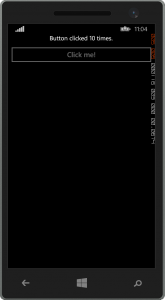
As you see, Button1CanClick() returns true for the first ten clicks, then returns false. That means the button should be enabled to start, but it should automatically disable after the tenth click. This works perfectly in WPF.

However, when I ported this code over to Xamarin Forms, I had a few problems.

CommandManager.RequerySuggested missing

The project didn’t build because RelayCommand references CommandManager.RequerySuggested which doesn’t work because it is part of PresentationCore, a library which doesn’t exist in Xamarin Forms.
Resolution: I replaced RelayCommand with Command from Xamarin Forms.

    public ButtonViewModel Button1
    {
        get
        {
            return _Button1 ?? (_Button1 = new ButtonViewModel
            {
                Text = "Click me!",
                Command = new Command(f => Button1Clicked(), f => Button1CanClick())
            });
        }
    } private ButtonViewModel _Button1;
    public class ButtonViewModel : ViewModelBase
    {
        public string Text
        {
            get { return _Text; }
            set { SetProperty(ref _Text, value); }
        } private string _Text;

        public Command Command
        {
            get { return _Command; }
            set { SetProperty(ref _Command, value); }
        } Command _Command;
    }

The project built perfectly and ran after that.

CanExecute method is not called after each click

The button didn’t disabled after 10 clicks. In fact, the CanExecute method was only called once at first load. I expected it to be called by any number of events, but it was never called. In WPF, it is CommandManager.RequerySuggested that makes this work, so with that code not existing, the CanExecuteChanged event must be fired manually.

Well, it seems that a simple way to do this would be to subscribe to the PropertyChanged event. So I deviced to bring back RelayCommand only this time inherit from Command.

using System;
using System.ComponentModel;
using Xamarin.Forms;

namespace MVVM
{
    public class RelayCommand : Command
    {
        public RelayCommand(Action<object> execute)
            : base(execute)
        {
        }

        public RelayCommand(Action execute)
            : this(o => execute())
        {
        }

        public RelayCommand(Action<object> execute, Func<object, bool> canExecute, INotifyPropertyChanged npc = null)
            : base(execute, canExecute)
        {
            if (npc != null)
                npc.PropertyChanged += delegate { ChangeCanExecute(); };
        }

        public RelayCommand(Action execute, Func<bool> canExecute, INotifyPropertyChanged npc = null)
            : this(o => execute(), o => canExecute(), npc)
        {
        }
    }
}

Now I can go back to using RelayCommand only add a parameter to pass the host object, using the keyword this.

    public ButtonViewModel Button1
    {
        get
        {
            return _Button1 ?? (_Button1 = new ButtonViewModel
            {
                Text = "Click me!",
                Command = new Command(f => Button1Clicked(), f => Button1CanClick(), this)
            });
        }
    } private ButtonViewModel _Button1;

So every time the PropertyChanged event fires, CanExecute is called. Note that for production, you may have to do checks outside of when the PropertyChanged event fires depending on what you are evaluating in CanExecute.

Button disabled by CanExecute

It works in Android and iOS as well.

Xamarin Forms Conclusion

I have no complaints with the technology. XAML and Binding and MVVM appear to be working quite well. All the benefits declarative UI and MVVM layers, combined with the ability to code for all mobile platforms in one place, in one language. It would be too hard to create full desktop app in WPF either as the ViewModel is reuseable. Xamarin also supports Mac OSX. So really you are looking at the future go to tool for building cross platform applications that aren’t web-based.

A FileTextBox control in WPF

Have you ever wanted a text file to be displayed in readonly fashion in a WPF window? Perhaps you have a log file and you want the UI to stay synced with the log updates to the file? Maybe you simply want to write a WPF version of WinTail?

Well, I just wrote a control in which you can set file path to a DependencyProperty and the UI will stay up to date. I created a child of TextBox called FileTextBox and implemented FileSystemWatcher.

Update: 6/16/2014 – Added AutoScroll.

using System;
using System.IO;
using System.Windows;
using System.Windows.Controls;

namespace WpfSharp.UserControls
{
    public class FileTextBox : TextBox
    {
        #region Private fields
        private bool _ChangedHandlerAdded;
        private bool _CreatedHandlerAdded;
        private bool _DeletedHandlerAdded;
        private bool _RenameHandlerAdded;
        #endregion

        #region constructor
        public FileTextBox()
        {
            AcceptsReturn = true;
            IsReadOnly = true;
            AutoScroll = true;
        }
        #endregion

        #region Properties
        /// <summary>
        /// If true, the FileTextBox will always scroll to the end when updated.
        /// </summary>
        public bool AutoScroll { get; set; }
        #endregion

        #region File Dependency Property
        public string File
        {
            get { return (string)GetValue(FileProperty); }
            set { SetValue(FileProperty, value); }
        }

        // Using a DependencyProperty as the backing store for File.  This enables animation, styling, binding, etc...
        public static readonly DependencyProperty FileProperty =
            DependencyProperty.Register("File", typeof(string), typeof(FileTextBox), new FrameworkPropertyMetadata(OnFilePropertyChanged));

        private static void OnFilePropertyChanged(DependencyObject sender, DependencyPropertyChangedEventArgs args)
        {
            var ftb = sender as FileTextBox;
            if (ftb == null || args.NewValue == null || string.IsNullOrWhiteSpace(args.NewValue.ToString()))
            {
                return;
            }
            var dir = GetDirectory(ref args);
            if (!string.IsNullOrWhiteSpace(dir) && Directory.Exists(dir))
            {
                ftb.Watcher.Path = Path.GetDirectoryName(args.NewValue.ToString());
                ftb.Watcher.Filter = Path.GetFileName(args.NewValue.ToString());
                ftb.AddEvents();
                ftb.Watcher.EnableRaisingEvents = true;
                ftb.UpdateFile();
            }
            else
            {
                ftb.Text = string.Empty;
            }
        }

        private static string GetDirectory(ref DependencyPropertyChangedEventArgs args)
        {
            try
            {
                return Path.GetDirectoryName(args.NewValue.ToString());
            }
            catch (Exception)
            {
                return null;
            }
        }
        #endregion

        private FileSystemWatcher Watcher
        {
            get { return _Watcher ?? (_Watcher = BuildWatcher()); }
        } private FileSystemWatcher _Watcher;

        private FileSystemWatcher BuildWatcher()
        {
            var watcher = new FileSystemWatcher { NotifyFilter = NotifyFilters.LastAccess | NotifyFilters.LastWrite | NotifyFilters.FileName | NotifyFilters.DirectoryName };
            return watcher;
        }

        public void OnFileDeleted(object sender, FileSystemEventArgs e)
        {
            Dispatcher.Invoke(UpdateFile);
        }

        public void OnFileChanged(object sender, FileSystemEventArgs e)
        {
            Dispatcher.Invoke(UpdateFile);
        }

        public void OnFileCreated(object sender, FileSystemEventArgs e)
        {
            Dispatcher.Invoke(() =>
            {
                UpdateFile();
                EnableRaiseEvents();
            });
        }

        public void OnFileRenamed(object sender, RenamedEventArgs e)
        {
            Dispatcher.Invoke(UpdateFile);
        }

        private void EnableRaiseEvents()
        {
            Dispatcher.Invoke(() =>
            {
                if (!Watcher.EnableRaisingEvents)
                    Watcher.EnableRaisingEvents = true;
            });
        }

        private void UpdateFile()
        {
            if (!System.IO.File.Exists(File))
            {

                Text = string.Empty;
                return;
            }
            using (var fs = new FileStream(File, FileMode.Open, FileAccess.Read, FileShare.ReadWrite))
            {
                using (var sr = new StreamReader(fs))
                {
                    Text = sr.ReadToEnd();
                    if (AutoScroll)
                        ScrollToEnd();
                }
            }
        }

        private void AddEvents()
        {
            if (!_CreatedHandlerAdded)
            {
                Watcher.Created += OnFileCreated;
                _CreatedHandlerAdded = true;
            }
            if (!_ChangedHandlerAdded)
            {
                Watcher.Changed += OnFileChanged;
                _ChangedHandlerAdded = true;
            }
            if (!_DeletedHandlerAdded)
            {
                Watcher.Deleted += OnFileDeleted;
                _DeletedHandlerAdded = true;
            }
            if (!_RenameHandlerAdded)
            {
                Watcher.Renamed += OnFileRenamed;
                _RenameHandlerAdded = true;
            }
        }
    }
}

As always, feedback is appreciated.

A SpinningImage control in WPF

In the past, I once wrote an article about WPF replacement options for an animated gif.

I have added an example project on GitHub: WpfSharp.Controls

Recently I needed to use this again, but I wanted a control that was more MVVM friendly. I also didn’t want to have to add a bunch of XAML every time I used it. This might sound crazy, but I wanted a reusable object. (Crazy right? 😉 Anyway, this led me to create a custom control that inherits from Image called SpinningImage.

So here is what I wanted. An Image with a simple bool dependency property that makes the image spin when true and stop spinning when false.

I used both XAML and csharp for this:

<Image x:Class="WpfSharp.UserControls.SpinningImage"
             xmlns="http://schemas.microsoft.com/winfx/2006/xaml/presentation"
             xmlns:x="http://schemas.microsoft.com/winfx/2006/xaml"
             xmlns:mc="http://schemas.openxmlformats.org/markup-compatibility/2006" 
             xmlns:d="http://schemas.microsoft.com/expression/blend/2008" 
             Name="ImageInstance"
             mc:Ignorable="d" 
             d:DesignHeight="300" d:DesignWidth="300"
             RenderTransformOrigin="0.5, 0.5" >
    <Image.Resources>
        <Storyboard x:Key="Spin360" Storyboard.TargetName="ImageInstance" Storyboard.TargetProperty="RenderTransform.(RotateTransform.Angle)">
            <DoubleAnimation From="0" To="360" BeginTime="0:0:0" Duration="0:0:2" RepeatBehavior="Forever" />
        </Storyboard>
    </Image.Resources>
    <Image.RenderTransform>
        <RotateTransform Angle="0" />
    </Image.RenderTransform>
</Image>
using System.Windows;
using System.Windows.Media.Animation;

namespace WpfSharp.UserControls
{
    /// <summary>
    /// Interaction logic for SpinningImage.xaml
    /// </summary>
    public partial class SpinningImage
    {
        public SpinningImage()
        {
            InitializeComponent();
        }

        public Storyboard Spinner
        {
            get { return _Spinner ?? (_Spinner = (Storyboard)FindResource("Spin360")); }
        } private Storyboard _Spinner;

        public bool SpinnerState
        {
            get { return (bool)GetValue(SpinnerStateProperty); }
            set { SetValue(SpinnerStateProperty, value); }
        }

        // Using a DependencyProperty as the backing store for SpinnerState.  This enables animation, styling, binding, etc...
        public static readonly DependencyProperty SpinnerStateProperty =
            DependencyProperty.Register("SpinnerState", typeof(bool), typeof(SpinningImage), new UIPropertyMetadata(false, OnSpinnerStatePropertyChanged));

        public static void OnSpinnerStatePropertyChanged(DependencyObject source, DependencyPropertyChangedEventArgs e)
        {
            var view = source as SpinningImage;
            if (view == null) return;
            if ((bool)e.NewValue)
                view.Spinner.Begin();
            else
                view.Spinner.Stop();
        }
    }
}

Now to use this in XAML, it is quite simple.

            <wpfsharp:SpinningImage Name="ImageGraySpinner" Source="/Images/GraySpinner.png" Height="128" Width="128" SpinnerState="{Binding Path=IsExecuting}"/>

Feel free to enhance it. It probably would be nice to enhance this and make dependency properties for Storyboard variables such as Duration. It might even be a good idea to move the StoryBoard to code and eliminate the XAML in the custom control. Either way, this control is easy to stick into a library and use.

A simple TrimmedTextBox for WPF

So I wanted a TextBox that trims automatically. At first I played with the idea of a converter, but that just didn’t work out. Try using a trim converter with UpdateSourceTrigger=PropertyChanged and you will see what I mean. Yes, it seems you cannot even type a space. I need the trimming to occur after losing focus.

After thinking about it, a converter was the wrong method anyway. If I want a TextBox that always trims when it loses focus, why not just make one by inheriting from TextBox and adding a method to the LostFocus event. So I did.

using System.Windows.Controls;

namespace WpfSharp.UserControls
{
    public class TrimmedTextBox : TextBox
    {
        public TrimmedTextBox()
        {
            LostFocus += TrimOnLostFocus;
        }

        void TrimOnLostFocus(object sender, System.Windows.RoutedEventArgs e)
        {
            var trimTextBox = sender as TrimmedTextBox;
            if (trimTextBox != null)
                trimTextBox.Text = trimTextBox.Text.Trim();
        }
    }
}

Now to use this in XAML, add this namespace to your UserControl or Window:

xmlns:wpfsharp="clr-namespace:WpfSharp.UserControls;assembly=WpfSharp"

Then use the object like this:

<wpfsharp:TrimmedTextBox Name="TextBoxAccount" TextWrapping="Wrap" MinWidth="200" Text="{Binding Account}" />

Remember, it is the simple solutions that are best.

Your first WPF Application (Video)

Download the C# project here:

FirstWpfApplication.zip

Return to Video List:
Video List

A ListBox for strings that supports add and delete

Ok, I was quite annoyed when I could not bind to an ObservableCollection and be able to add and remove rows in a DataGrid. I just wanted a list of strings to display and to easily update them.

I was sad that this does’t exist by default, so I created one. This is actually a UserControl that hosts a ListBox, but it works just like a ListBox. I can add to and delete from a bound ObservableCollection.

I wanted it to support pressing delete. Right-clicking and choosing delete. Typing in a new item at the bottom and clicking Add. Or click enter after typing.

I wanted it to work with List too in that if an item is added from the UI, the UI and the List are updated and I got that to work. However, if the List is updated in code and not via the ui, the UI will not know about this change. That is what ObservableObject is for.

<UserControl x:Class="AddRemoveStringList.StringListBox"
             xmlns="http://schemas.microsoft.com/winfx/2006/xaml/presentation"
             xmlns:x="http://schemas.microsoft.com/winfx/2006/xaml"
             xmlns:mc="http://schemas.openxmlformats.org/markup-compatibility/2006" 
             xmlns:d="http://schemas.microsoft.com/expression/blend/2008" 
             mc:Ignorable="d" 
             d:DesignHeight="300" d:DesignWidth="300">
    <Grid>
        <Grid.ColumnDefinitions>
            <ColumnDefinition Width="*" />
            <ColumnDefinition Width="Auto" />
        </Grid.ColumnDefinitions>
        <Grid.RowDefinitions>
            <RowDefinition Height="Auto" />
            <RowDefinition Height="*" />
            <RowDefinition Height="Auto" />
        </Grid.RowDefinitions>
        <Label Name="TitleLabel" Content="{Binding Title}" Grid.ColumnSpan="2"/>
        <ListBox x:Name="Box" Grid.Row="1" Grid.ColumnSpan="2" KeyDown="OnDeletePressed" ItemsSource="{Binding ItemsSource}">
            <ListBox.Resources>
                <ContextMenu x:Key="ContextMenuDelete">
                    <MenuItem Header="_Delete" Click="MenuDeleteClicked" />
                </ContextMenu>
            </ListBox.Resources>
            <ListBox.ItemContainerStyle>
                <Style TargetType="{x:Type ListBoxItem}" BasedOn="{StaticResource {x:Type ListBoxItem}}">
                    <Setter Property="ContextMenu" Value="{DynamicResource ContextMenuDelete }">
                    </Setter>
                </Style>
            </ListBox.ItemContainerStyle>
        </ListBox>
        <TextBox Name="AddStringBox" Grid.Row="2" KeyDown="OnEnterPressed" />
        <Button Name="AddStringButton" Content="Add" Grid.Row="2" Grid.Column="1" Click="AddClicked" MinWidth="30" />
    </Grid>
</UserControl>
using System.Collections.Generic;
using System.Collections.Specialized;
using System.Windows;
using System.Windows.Controls;
using System.Windows.Input;

namespace AddRemoveStringList
{
    /// <summary>
    /// Interaction logic for StringListBox.xaml
    /// </summary>
    public partial class StringListBox : UserControl
    {
        public StringListBox()
        {
            InitializeComponent();
            Box.DataContext = this;
            TitleLabel.DataContext = this;
        }

        #region Events
        private void AddClicked(object sender, RoutedEventArgs e)
        {
            ItemsSource.Add(AddStringBox.Text);
            AddStringBox.Clear();
            object o = this.DataContext;
            if (!(o is INotifyCollectionChanged))
            {
                this.DataContext = null;
                this.DataContext = o;
            }
        }

        private void MenuDeleteClicked(object sender, RoutedEventArgs e)
        {
            ItemsSource.Remove(Box.SelectedItem.ToString());
        }

        private void OnDeletePressed(object sender, KeyEventArgs e)
        {
            if (e.Key == Key.Delete)
            {
                MenuDeleteClicked(sender, e);
            }
        }

        private void OnEnterPressed(object sender, KeyEventArgs e)
        {
            if (e.Key == Key.Enter)
            {
                AddClicked(this, e);
            }
        }
        #endregion

        #region ItemsSource DependencyProperty
        public ICollection<string> ItemsSource
        {
            get { return (ICollection<string>)GetValue(ItemsSourceProperty); }
            set { SetValue(ItemsSourceProperty, value); }
        }

        public static readonly DependencyProperty ItemsSourceProperty =
            DependencyProperty.Register("ItemsSource", typeof(ICollection<string>), typeof(StringListBox), null);
        #endregion

        #region Title DependencyProperty
        public string Title
        {
            get { return (string)GetValue(TitleProperty); }
            set { SetValue(TitleProperty, value); }
        }

        public static readonly DependencyProperty TitleProperty =
            DependencyProperty.Register("TitleProperty", typeof(string), typeof(StringListBox), null);
        #endregion
    }
}

And here is how you use it just like you would a ListBox.

<Window x:Class="AddRemoveStringList.MainWindow"
        xmlns="http://schemas.microsoft.com/winfx/2006/xaml/presentation"
        xmlns:x="http://schemas.microsoft.com/winfx/2006/xaml"
        xmlns:loc="clr-namespace:AddRemoveStringList"
        Title="MainWindow" Height="350" Width="525"
        >
    <Grid>
        <Grid.RowDefinitions>
            <RowDefinition Height="*"/>
            <RowDefinition Height="*"/>
        </Grid.RowDefinitions>
        <loc:StringListBox x:Name="ListViewStringList1" ItemsSource="{Binding StringList1}"  />
        <ListBox x:Name="ListViewStringList2" ItemsSource="{Binding StringList2}" Grid.Row="1" />
    </Grid>
</Window>

For those who wonder why I used code-behind and question if this is breaking MVVM, it is not. I am creating a reusable control here. When creating a control, the goal is to have everything in one object. Everything in the code behind is related to the UI code or uses an interface. You can use this and bind to it in MVVM just like you would a ListBox.

WPF will not die if Silverlight does!

I keep hearing in the community that Silverlight and WPF are dead. Why? Well, I think this is because Microsoft is moving to HTML5, CSS, and JavaScript for web apps and is providing that as an option for Windows 8 Metro apps. Because of this, Microsoft may have stopped development on Silverlight.

How does Silverlight affect WPF? It doesn’t! WPF is not a tool for writing web apps. There is a common misconception that the life span of Silverlight and WPF are tied together and if one dies, so does the other. This is far from accurate.

Silverlight != WPF

WPF and Silverlight Similarities

Sure, Silverlight and WPF have similarities. Here are some:

  1. They both use XAML.
  2. They share syntax and often code or XAML written in one works in the other.
  3. They share some code and libraries.

WPF and Silverlight Differences

Let’s look at the differences between WPF and Silverlight. It is in these differences that it becomes obvious that WPF is just beginning a long life as an amazing API for writing rich interfaces.

WPF  (Windows Presentation Foundation)

  1. It is tool for writing full-featured desktop applications that run on Windows.
  2. It is a permanent part of the .NET Framework.
  3. It competes with Windows Forms only for writing desktop applications.
  4. Current applications are being written with WPF, such as VS 2012. Expression Studio. Etc…
  5. Future versions of those applications are likely to be written in WPF.

Silverlight

  1. It is a tool for web applications.
  2. It requires a browser plugin.
  3. It competes with Flash, Java web apps, and a straight HTML-CSS-JS solutions
  4. Applications using Silverlight are going to also have HTLM5-CSS-JS solutions in future releases. Such as SharePoint and Powerview.
  5. Future versions of applications using Silverlight are likely to use HTML5-CSS-JS.

So as you see their purposes are quite different and the life of WPF is not tied to Silverlight.

Let’s look at when the support for each stops.

Silverlight 5 Support Lifecycle

Silverlight is listed on Microsoft’s site as being supported until 2021. This means that you probably should be concerned right now. There is a question as to whether Silverlight 6 will be released. For these reasons, people are thinking that Silverlight has an end of life in site.

Sometimes a product is so popular it lives on, sometimes it just goes away. While Silverlight became popular, it didn’t become popular enough. The effort to make it work on all the different platforms was too hard and never completed. By the time such an effort were to succeed, HTML5 will already be out there and working on every platform. The mistake Microsoft made was not making Silverlight a free open source solution. If they had, its adoption would have been far greater. It would likely work on every platform already, and it would have succeeded to replace Flash by 2010 and would be a viable option for those who don’t think HTML5 will be the solution everyone hopes. However, this did not happen. By 2021, Silverlight may just go away.

WPF Support LifeCycle

WPF’s life is tied to the life of Windows. See this quote:

Beginning with .NET 3.5 SP1, the .NET Framework is considered a Component of the Windows OS. Components follow the Support Lifecycle policy of their parent product or platform.[1]

So that statement alone should make you feel good about the life of WPF. WPF is a permanent part of the .NET Framework and will last as long as the Windows version it is released with. Windows 8 is supported until 2023 so WPF is supported at least until 2023 too. That is two years longer than Silverlight. However, does anyone believe that the next windows versions will not include .NET Framework? I expect .NET Framework to be a primary part of Windows releases for the next decade or more.

I expect that the version of Windows that releases after 2020 will have .NET Framework and WPF will be included.

WPF is also providing windows application developers with stable frameworks, such as MVP and MVVM, for enterprises to build their software.  Companies are still moving to WPF and they still should be because Microsoft is moving to WPF.

Conclusion

Say “Yes” to choosing WPF

If you are just deciding on a solution for a Windows application’s user interface, you should choose WPF.

If you are making product road map decisions and you are looking ahead a five years or even a decade and you want to know what user interface to use, you should use WPF.

WPF has just begun what is going to be a long life that could span decades. It should be your primary choice for feature rich desktop applications. Visual Studio 2012 and other new and recent applications will use WPF and many future versions of software will run WPF.

Say “For now” to choosing Silverlight

If you are just deciding on a solution for a web application’s user interface today, you wouldn’t go wrong choosing Silverlight. You can use it for now. Let’s face it. HTML5 isn’t here yet. It is still “coming” and how long will it continue to be “coming” before it gets here?

If you are making product road map decisions and you are looking ahead a five years or even a decade and you want to know what user interface to use, you should probably not choose Silverlight or at least have an option that if Silverlight 6 is not released to go with another option, such as HTML5-CSS-JS.

Silverlight is having a mid-life crisis and yes it may die when support ends in 2021. Silverlight attempted to solve the limitations with web applications. However, while it didn’t fall short in features, it fell short in not being cross-platform. HTML5 will replace Flash, not Silverlight. And yet Silverlight is still useful today in 2012 and will probably still be useful for years. It will live for almost a decade and is still a good solution to choose until HTML5 becomes mainstream and fully supported in every browser. If Microsoft released Silverlight 6 and extends its support (which many think will not happen) then it Silverlight will remain a positive choice for writing rapid business applications.

Using Expression Blend and Visual States for Image Swapping

For this example, lets think of a stop light during the traffic of your morning commute. There will be three images of a stop light. Each image will have either the red, yellow, or green light on.

Link: I used traffic light images from here: http://www.psdgraphics.com/psd-icons/traffic-lights-icon-psd

*** This can be done 100% in Expression Blend without using any code at all. ***

Note: This is for both Developers and Designers. It is for designers because they can do all of this without code. It is for Developers because they need to know to not go reinvent the wheel and spend their time writing code to do this.

Step 1 – Create a new WPF Application project

You can do this in either Visual Studio or Expression Blend. For this example, we will use Expression Blend 4.

  1. Open Expression Blend 4.
  2. Go to File | New Project.
  3. Choose WPF Application.
  4. Name the project and click OK.
    Note: I named this project SwitchImagesWithVisualStates.

Step 2 – Add Images to the WPF project

  1. Right-click on your project and choose Add new folder.
  2. Name the folder Images.
  3. Open your file system and copy or drag your images to this new folder in Expression Blend.
    Note: If you copy the images using the windows file system, you may have to add the files to the project.

Step 3 – Design the View

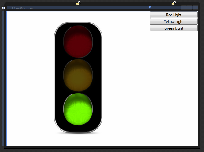
We are going to have a simple view for this example with the images on the left and buttons on the right.

  1. Open MainWindow.xaml.
  2. Add a column to the default Grid, so there are two columns.
  3. Make the columns 3* and 1*. This will make the left column 75% and the right column 25% of the Grid size.
  4. Add all thee images to the left column.
  5. Remove any margins, heights or widths, and vertical or horizontal alignments from the images.
    Note: This is important so the images are always in the same place.
    Note: This assumes that all three of your images are identically sized and properly placed.
  6. Name each Image: ImageRedLight, ImageYellowLight, ImageGreenLight.
  7. Add a StackPanel to the right column.
  8. Remove any margins, heights or widths, and vertical or horizontal alignments from the StackPanel.
  9. Click to select the StackPanel in the Objects and Timeline box.
  10. Add three buttons to the StackPanel in the right column.
  11. Remove any margins, heights or widths, and vertical or horizontal alignments from the buttons.
  12. Name each button: ButtonRedLight, ButtonYellowLight, ButtonGreenLight.
Your View should now look like this in the Expresion Blend designer.

Your Xaml should look like this:

<Window
	xmlns="http://schemas.microsoft.com/winfx/2006/xaml/presentation"
	xmlns:x="http://schemas.microsoft.com/winfx/2006/xaml"
	x:Class="SwitchImagesWithVisualStates.MainWindow"
	x:Name="Window"
	Title="MainWindow"
	Width="640" Height="480">
	<Grid x:Name="LayoutRoot">
		<Grid.ColumnDefinitions>
			<ColumnDefinition Width="3*"/>
			<ColumnDefinition Width="1*"/>
		</Grid.ColumnDefinitions>
		<Image Name="ImageRedLight" Source="Images/Red.png" />
		<Image Name="ImageYellowLight" Source="Images/Yellow.png" />
		<Image Name="ImageGreenLight" Source="Images/Green.png" />
		<StackPanel Grid.Column="1">
			<Button Name="ButtonRedLight" Content="Red Light"/>
			<Button Name="ButtonYellowLight" Content="Yellow Light"/>
			<Button Name="ButtonGreenLight" Content="Green Light"/>
		</StackPanel>
	</Grid>
</Window>

Step 4 – Add VisualStates in a VisualStateGroup

  1. In Expression Studio, click on the States tab.
    Note: Sometimes the States tab is hard to find.
  2. On the top right of the States tab, click icon that has a + sign to add a VisualStateGroup.
  3. Name the VisualStateGroup.
    Note: I named mine VisualStateGroupTrafficLights.
  4. Under the VisualStateGroup you now have another icon with a + sign (the Add state icon) that add a VisualState to the VisualStateGroup. Click it three times to add three VisualStates.
  5. Name the VisualStates: VisualStateRedLight, VisualStateYellowLight, VisualStateGreenLight.

Step 5 – Set new values for each VisualState

  1. Configure the VisualStateRedLight.
    1. Click on VisualStateRedLight.
    2. You will see a red outline around the designer and the words: VisualStateRedLight state recording is on.
    3. In the Objects and Timeline tab, press and hold control and click to select both ImageYellowLight and ImageGreenLight.
    4. Go to the Properties tab.
    5. Change the visibility of the images to Hidden.
  2. Configure the VisualStateYellowLight.
    1. Click on VisualStateYellowLight.
    2. You will see a red outline around the designer and the words: VisualStateYellowLight state recording is on.
    3. In the Objects and Timeline tab, press and hold control and click to select both ImageRedLight and ImageGreenLight.
    4. Go to the Properties tab.
    5. Change the visibility of the images to Hidden.
  3. Configure the VisualStateGreenLight.
    1. Click on VisualStateGreenLight.
    2. You will see a red outline around the designer and the words: VisualStateGreenLight state recording is on.
    3. In the Objects and Timeline tab, press and hold control and click to select both ImageRedLight and ImageYellowLight.
    4. Go to the Properties tab.
    5. Change the visibility of the images to Hidden.

Step 6 – Configure each Button to switch to a VisualState on click

  1. Configure ButtonRedLight.
    1. In Assets, search for GoToStateAction.
    2. Click and drag the GoToStateAction and drop it in the designer over the ButtonRedLight.
    3. Go to Properties.
    4. Name it GoToRedLightState.
    5. Set the StateName to VisualStateRedLight.
  2. Configure ButtonYellowLight.
    1. In Assets, search for GoToStateAction.
    2. Click and drag the GoToStateAction and drop it in the designer over the ButtonYellowLight.
    3. Go to Properties.
    4. Name it GoToYellowLightState.
    5. Set the StateName to VisualStateYellowLight.
  3. Configure ButtonGeenLight.
    1. In Assets, search for GoToStateAction.
    2. Click and drag the GoToStateAction and drop it in the designer over the ButtonGreenLight.
    3. Go to Properties.
    4. Name it GoToGreenLightState.
    5. Set the StateName to VisualStateGreenLight.

That is it. You have now written an application that switches the image.

Here is your final Xaml.

<Window
	xmlns="http://schemas.microsoft.com/winfx/2006/xaml/presentation"
	xmlns:x="http://schemas.microsoft.com/winfx/2006/xaml"
	xmlns:i="http://schemas.microsoft.com/expression/2010/interactivity"
	xmlns:ei="http://schemas.microsoft.com/expression/2010/interactions"
	x:Class="SwitchImagesWithVisualStates.MainWindow"
	x:Name="Window"
	Title="MainWindow"
	Width="640" Height="480">
	<Grid x:Name="LayoutRoot">
		<VisualStateManager.VisualStateGroups>
			<VisualStateGroup x:Name="VisualStateGroupTrafficLights">
				<VisualState x:Name="VisualStateRedLight">
					<Storyboard>
						<ObjectAnimationUsingKeyFrames Storyboard.TargetProperty="(UIElement.Visibility)" Storyboard.TargetName="ImageYellowLight">
							<DiscreteObjectKeyFrame KeyTime="0" Value="{x:Static Visibility.Hidden}"/>
						</ObjectAnimationUsingKeyFrames>
						<ObjectAnimationUsingKeyFrames Storyboard.TargetProperty="(UIElement.Visibility)" Storyboard.TargetName="ImageGreenLight">
							<DiscreteObjectKeyFrame KeyTime="0" Value="{x:Static Visibility.Hidden}"/>
						</ObjectAnimationUsingKeyFrames>
					</Storyboard>
				</VisualState>
				<VisualState x:Name="VisualStateYellowLight">
					<Storyboard>
						<ObjectAnimationUsingKeyFrames Storyboard.TargetProperty="(UIElement.Visibility)" Storyboard.TargetName="ImageRedLight">
							<DiscreteObjectKeyFrame KeyTime="0" Value="{x:Static Visibility.Hidden}"/>
						</ObjectAnimationUsingKeyFrames>
						<ObjectAnimationUsingKeyFrames Storyboard.TargetProperty="(UIElement.Visibility)" Storyboard.TargetName="ImageGreenLight">
							<DiscreteObjectKeyFrame KeyTime="0" Value="{x:Static Visibility.Hidden}"/>
						</ObjectAnimationUsingKeyFrames>
					</Storyboard>
				</VisualState>
				<VisualState x:Name="VisualStateGreenLight">
					<Storyboard>
						<ObjectAnimationUsingKeyFrames Storyboard.TargetProperty="(UIElement.Visibility)" Storyboard.TargetName="ImageRedLight">
							<DiscreteObjectKeyFrame KeyTime="0" Value="{x:Static Visibility.Hidden}"/>
						</ObjectAnimationUsingKeyFrames>
						<ObjectAnimationUsingKeyFrames Storyboard.TargetProperty="(UIElement.Visibility)" Storyboard.TargetName="ImageYellowLight">
							<DiscreteObjectKeyFrame KeyTime="0" Value="{x:Static Visibility.Hidden}"/>
						</ObjectAnimationUsingKeyFrames>
					</Storyboard>
				</VisualState>
			</VisualStateGroup>
		</VisualStateManager.VisualStateGroups>
		<Grid.ColumnDefinitions>
			<ColumnDefinition Width="3*"/>
			<ColumnDefinition Width="1*"/>
		</Grid.ColumnDefinitions>
		<Image x:Name="ImageRedLight" Source="Images/Red.png" />
		<Image x:Name="ImageYellowLight" Source="Images/Yellow.png" />
		<Image x:Name="ImageGreenLight" Source="Images/Green.png" />
		<StackPanel Grid.Column="1">
			<Button x:Name="ButtonRedLight" Content="Red Light">
				<i:Interaction.Triggers>
					<i:EventTrigger EventName="Click">
						<ei:GoToStateAction x:Name="GoToRedLightState" StateName="VisualStateRedLight"/>
					</i:EventTrigger>
				</i:Interaction.Triggers>
			</Button>
			<Button x:Name="ButtonYellowLight" Content="Yellow Light">
				<i:Interaction.Triggers>
					<i:EventTrigger EventName="Click">
						<ei:GoToStateAction x:Name="GoToYellowLightState" StateName="VisualStateYellowLight"/>
					</i:EventTrigger>
				</i:Interaction.Triggers>
			</Button>
			<Button x:Name="ButtonGreenLight" Content="Green Light">
				<i:Interaction.Triggers>
					<i:EventTrigger EventName="Click">
						<ei:GoToStateAction x:Name="GoToGreenLightState" StateName="VisualStateGreenLight"/>
					</i:EventTrigger>
				</i:Interaction.Triggers>
			</Button>
		</StackPanel>
	</Grid>
</Window>

Notice there are additional dependencies added that come from System.Windows.Interactivity.dll:

  1. xmlns:i=”http://schemas.microsoft.com/expression/2010/interactivity”
  2. Mli>xmlns:ei=”http://schemas.microsoft.com/expression/2010/interactions”

There is a lot more to learn. We didn’t even touch Transition or Easing methods. We didn’t discuss how to hook this up into a full application, or possible an MVVM application.

Loading or Saving a XAML Resource Dictionary

Here is a rudimentary example of how to load a ResourceDictionary.xaml file and then how to change it and save the changes.

<ResourceDictionary xmlns="http://schemas.microsoft.com/winfx/2006/xaml/presentation"
                    xmlns:x="http://schemas.microsoft.com/winfx/2006/xaml"
                    xmlns:sys="clr-namespace:System;assembly=mscorlib">
    <sys:String x:Key="HW">Hello, World</sys:String>
</ResourceDictionary>
using System;
using System.IO;
using System.Windows;
using System.Windows.Markup;

namespace ReadAndWriteToXaml
{
    /// <summary>
    /// Interaction logic for App.xaml
    /// </summary>
    public partial class App : Application
    {
        public static ResourceDictionary Dictionary;
        public static String XamlFileName = "Dictionary1.xaml";

        public App()
        {
            LoadStyleDictionaryFromFile(XamlFileName);
        }

        /// <summary>
        /// This funtion loads a ResourceDictionary from a file at runtime
        /// </summary>
        public void LoadStyleDictionaryFromFile(string inFileName)
        {
            if (File.Exists(inFileName))
            {
                try
                {
                    using (var fs = new FileStream(inFileName, FileMode.Open, FileAccess.Read, FileShare.Read))
                    {
                        // Read in ResourceDictionary File
                        Dictionary = (ResourceDictionary)XamlReader.Load(fs);
                        // Clear any previous dictionaries loaded
                        Resources.MergedDictionaries.Clear();
                        // Add in newly loaded Resource Dictionary
                        Resources.MergedDictionaries.Add(Dictionary);
                    }
                }
                catch
                {
                    // Do something here if file not found
                }
            }
        }

        private void Application_Exit_1(object sender, ExitEventArgs e)
        {
            try
            {
                Dictionary["HW"] += "Hello, back!"; 
                StreamWriter writer = new StreamWriter(XamlFileName);
                XamlWriter.Save(Dictionary, writer);
            }
            catch
            {
                // Do something here if file not found
            }
        }
    }
}

Note: Unfortunately you cannot use two way mode when binding to DynamicResource objects, so editing the xaml file is made a bit more complex. But hopefully, this will help you get started.